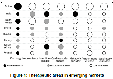
The colour of the dots represents the relative intensity of therapeutic area research within a specific country across each row. The size of the dots represents the relative proportions of research across different countries within a specific therapeutic area in each column.
(Adaptado de Ajay Gautam, Lily Li e Kumar Srinivasan, Market watch: Therapeutic area ‘heat map’ for emerging markets. Nature Reviews Drug Discovery 14, p. 518, jul. 2015.)
De acordo com o gráfico apresentado,